
Anúncios
Visual balance is the invisible force that transforms ordinary designs into captivating works of art that resonate with viewers on a profound psychological level.
Whether you’re designing a website, creating marketing materials, or crafting social media graphics, understanding visual balance is essential for producing designs that feel right, even when your audience can’t articulate why. This comprehensive guide will unveil the principles, techniques, and secrets behind achieving stunning visual harmony in every project you undertake.
🎨 Understanding the Foundation of Visual Balance
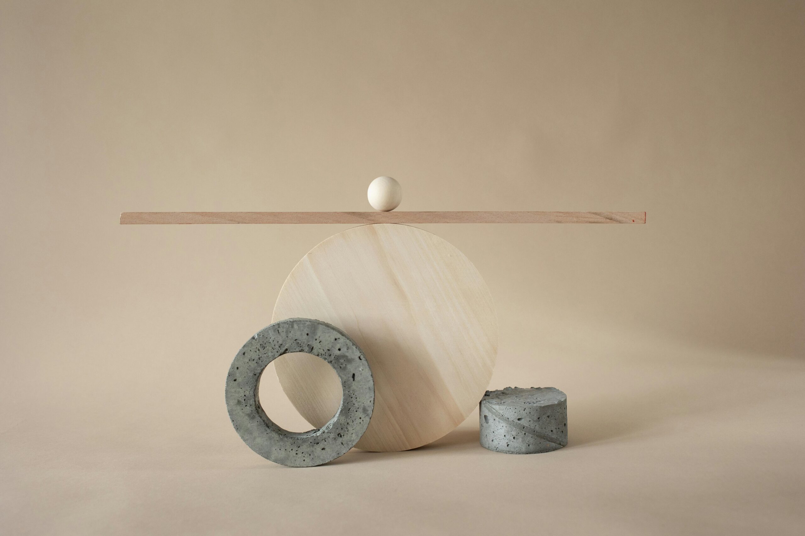
Visual balance refers to the distribution of visual weight within a composition, creating a sense of stability and equilibrium that pleases the eye. Think of it as an invisible scale where elements on one side must counterbalance those on the other, not necessarily through symmetry, but through careful consideration of size, color, texture, and positioning.
The human brain constantly seeks patterns and equilibrium in everything we observe. When a design lacks proper balance, viewers experience subtle discomfort, even if they can’t identify the exact problem. Conversely, balanced designs feel natural and inviting, encouraging deeper engagement with the content.
Visual weight is influenced by numerous factors beyond physical size. A small element in bright red can carry as much visual weight as a larger element in pale gray. Understanding these nuances separates amateur designers from true visual artists who can manipulate perception with precision and purpose.
The Four Essential Types of Visual Balance
Symmetrical Balance: The Classic Approach
Symmetrical balance, also known as formal balance, occurs when elements are mirrored across a central axis. This traditional approach creates stability, professionalism, and trustworthiness—qualities that make it particularly popular in corporate branding, government communications, and classical design applications.
The advantage of symmetrical balance lies in its predictability and ease of execution. When you place identical or similar elements on both sides of your composition, you automatically achieve equilibrium. However, the challenge comes in avoiding monotony and creating visual interest within this structured framework.
Many successful symmetrical designs incorporate subtle variations that maintain balance while adding character. A perfectly symmetrical logo might include color gradients or textural differences that keep the design from feeling too rigid or sterile.
Asymmetrical Balance: The Dynamic Alternative ⚡
Asymmetrical balance represents a more contemporary approach where different elements of varying visual weights create equilibrium through strategic positioning. This technique requires more sophistication and understanding but yields designs that feel modern, energetic, and compelling.
The key to asymmetrical balance lies in understanding that a small, visually heavy element can balance a larger, lighter one. A tiny splash of vibrant color can counterbalance an extensive area of neutral tones. A detailed texture in one corner can offset empty space elsewhere in the composition.
This approach dominates modern web design, where F-pattern and Z-pattern layouts guide users through content while maintaining visual equilibrium. Magazine layouts, poster designs, and editorial spreads frequently employ asymmetrical balance to create dynamic, attention-grabbing compositions.
Radial Balance: The Circular Symphony
Radial balance arranges elements around a central point, radiating outward like spokes on a wheel or petals on a flower. This powerful technique naturally draws the viewer’s eye to the focal point while distributing visual weight evenly across the composition.
Mandala designs, logo creation, and circular badges frequently utilize radial balance. This approach works exceptionally well for designs requiring emphasis on a central message or image while maintaining harmony throughout the entire composition.
Mosaic Balance: Organized Chaos
Mosaic balance, sometimes called crystallographic balance, appears chaotic at first glance but maintains equilibrium through consistent pattern and repetition. Think of a Jackson Pollock painting or a complex wallpaper pattern where no single element dominates, yet everything works together cohesively.
This sophisticated approach requires confidence and restraint. While it may seem like random arrangement, successful mosaic balance follows underlying principles of color distribution, spacing, and rhythm that create harmony within apparent disorder.
🎯 The Visual Weight Spectrum: What Makes Elements Heavy or Light
Mastering visual balance requires understanding what gives elements their perceived weight. Size is the most obvious factor, but numerous other characteristics influence how much attention an element commands within your composition.
Color saturation plays a tremendous role in visual weight. Bright, saturated colors naturally attract more attention than muted, desaturated tones. A small button in electric blue will command more visual weight than a large section filled with light gray, making it essential to consider color choices when balancing your designs.
Texture and complexity add visual weight as well. Intricate patterns, detailed illustrations, or highly textured areas draw the eye more strongly than smooth, simple surfaces. This principle explains why white space feels lighter despite occupying substantial area—its simplicity gives it minimal visual weight.
Contrast creates weight through difference. An element that stands apart from its surroundings through color, size, shape, or style automatically gains visual weight. This principle is fundamental to creating effective focal points while maintaining overall balance.
Practical Techniques for Achieving Perfect Balance
The Grid System: Your Invisible Framework
Professional designers rely on grid systems to establish structure and maintain balance throughout their compositions. Grids provide invisible guidelines that organize elements consistently, creating harmony even in complex, multi-element designs.
The classic 12-column grid system offers flexibility while maintaining order, allowing designers to create various layouts that all share a common structural foundation. Responsive web design particularly benefits from grid-based approaches, ensuring balance across different screen sizes and devices.
Breaking the grid intentionally can create emphasis and visual interest, but this technique only works when the underlying structure exists. Understanding the rules allows you to break them effectively, creating dynamic compositions that still feel balanced.
The Power of White Space (Negative Space) ✨
White space isn’t wasted space—it’s a powerful design element that provides breathing room, creates emphasis, and contributes to overall balance. Many beginning designers feel compelled to fill every inch of their canvas, resulting in cluttered, overwhelming compositions.
Strategic use of negative space allows important elements to stand out while giving the viewer’s eye places to rest. Apple’s minimalist design philosophy demonstrates how white space can become a brand signature, creating elegant, balanced designs that feel sophisticated and premium.
White space also improves readability and comprehension. Text surrounded by adequate margins is easier to read and retain than densely packed information. This functional benefit makes white space essential for user experience, not just aesthetic appeal.
The Rule of Thirds: Photography’s Gift to Design
Borrowed from photography, the rule of thirds divides your composition into nine equal sections using two horizontal and two vertical lines. Placing important elements along these lines or at their intersections creates natural balance and visual interest.
This technique works because it creates asymmetrical balance that feels more dynamic than centered compositions. The human eye naturally gravitates toward these intersection points, making them ideal locations for focal points, calls to action, or key messages.
While the rule of thirds provides an excellent starting point, remember it’s a guideline rather than a law. Once you understand why it works, you can adapt it or break it intentionally to achieve specific effects.
📐 Color Balance: The Hidden Dimension
Color distribution significantly impacts visual balance, yet many designers focus primarily on spatial arrangement while neglecting chromatic equilibrium. A composition might be spatially balanced but feel off-kilter due to poor color distribution.
The 60-30-10 rule offers a reliable framework for color balance: use your dominant color for 60% of the design, a secondary color for 30%, and an accent color for 10%. This proportion creates hierarchy and balance while preventing any single color from overwhelming the composition.
Complementary colors create natural balance through their position on the color wheel. When used thoughtfully, opposites like blue and orange or red and green provide visual tension that energizes designs without creating discord.
Temperature balance matters too. Warm colors (reds, oranges, yellows) carry more visual weight than cool colors (blues, greens, purples), so balancing warm and cool tones creates equilibrium while adding depth and dimension to your designs.
Typography and Visual Balance: Words as Design Elements
Text isn’t just content—it’s a crucial visual element that affects overall balance. Font selection, size, weight, spacing, and placement all contribute to how typography integrates into your composition’s equilibrium.
Large, bold headlines carry substantial visual weight and must be balanced by either additional text, imagery, or strategic white space. Conversely, body copy in smaller fonts acts as texture, filling space with relatively light visual weight despite containing numerous words.
Alignment choices impact balance significantly. Centered text creates formal symmetry, while left-aligned text provides a strong vertical edge that can balance heavier elements elsewhere in the composition. Justified text creates solid blocks that function as architectural elements within your design.
🖼️ Balancing Images and Graphics Within Layouts
Photographs and illustrations often serve as the heaviest visual elements in a composition, requiring careful positioning and sizing to maintain overall balance. A single dominant image can anchor an entire layout, with all other elements positioned in relation to it.
When using multiple images, consider both their individual visual weight and their collective impact. A gallery of similar-sized photos creates mosaic balance, while varying sizes can establish hierarchy and guide the viewer’s eye through the composition.
Image cropping and framing affect visual weight considerably. Tight crops on faces or detailed subjects create high impact, while images with substantial internal negative space feel lighter despite occupying similar dimensions.
Testing and Refining Your Visual Balance
The Squint Test: A Designer’s Secret Weapon
The squint test is a simple yet powerful technique for evaluating visual balance. By squinting your eyes while viewing your design, you reduce detail and see only major shapes and tonal values. This perspective reveals whether your composition is bottom-heavy, lopsided, or properly balanced.
This technique also helps identify hierarchy issues. The elements that remain visible when squinting are your strongest focal points. If the wrong elements dominate, or if nothing stands out clearly, you need to adjust weights and contrast.
The Flip Test: Fresh Perspective Instantly 🔄
Flipping your design horizontally provides a fresh perspective that reveals balance problems your accustomed eye might miss. This technique is particularly valuable for detecting subtle asymmetries in supposedly symmetrical designs or identifying which side of an asymmetrical composition feels heavier.
Many design applications include flip or mirror functions specifically for this purpose. Designers often flip their work multiple times during the creation process, making adjustments each time until the composition maintains balance from both perspectives.
The Distance Test: Stepping Back for Clarity
Viewing your design from different distances reveals different aspects of its balance. Close examination shows detail work and fine adjustments, while distance viewing reveals overall composition, major weight distribution, and whether the design maintains its impact and balance when seen as a whole.
This principle applies to digital and print designs alike. Web designs should be evaluated at various zoom levels and on different devices, while print materials should be viewed at their intended viewing distance.
💡 Common Balance Mistakes and How to Avoid Them
Even experienced designers occasionally struggle with balance. Recognizing common pitfalls helps you avoid them in your own work and identify problems quickly when something feels off about your composition.
Overemphasis on symmetry often results in static, boring designs that fail to engage viewers. While symmetrical balance has its place, relying on it exclusively limits your creative options and can make your work feel dated or overly conservative.
Neglecting edge tension creates another common problem. Elements placed too close to composition edges can create uncomfortable tension, while those too far from edges waste space and miss opportunities for dynamic balance through edge interaction.
Inconsistent visual weight distribution leads to compositions that feel tilted or unstable. When all heavy elements cluster in one area without counterbalancing weights elsewhere, viewers experience subtle discomfort that undermines your design’s effectiveness.
Creating Visual Rhythm Through Balanced Repetition
Repetition creates rhythm, and rhythm contributes to balance. When you repeat elements throughout a composition—whether shapes, colors, textures, or patterns—you create visual connections that help unify and balance the overall design.
Strategic repetition distributes visual weight across your composition rather than concentrating it in isolated areas. A color that appears only once becomes a focal point, but that same color repeated in three locations creates a triangular rhythm that guides the eye around the composition.
Varying the scale or intensity of repeated elements maintains interest while preserving rhythmic balance. Identical repetition can become monotonous, but thoughtful variation within repetition creates sophisticated visual music that engages viewers.
🎪 Advanced Balance Techniques for Expert Results
Counterbalance: The Professional’s Approach
Counterbalance involves intentionally placing a heavier element on one side and balancing it with multiple lighter elements on the opposite side. This sophisticated technique creates dynamic tension while maintaining equilibrium, resulting in compositions that feel both stable and energetic.
The key to successful counterbalance lies in understanding cumulative visual weight. Three small elements together can balance one large element if positioned thoughtfully. This principle allows for complex, interesting compositions that avoid the predictability of simpler balance approaches.
Directional Balance: Guiding the Viewer’s Journey
Implied lines and directional cues within your design elements create invisible forces that affect balance. A figure looking toward one edge creates directional weight in that direction, requiring counterbalancing elements to prevent the composition from feeling lopsided.
Arrows, pointing shapes, and linear elements create strong directional forces that must be considered when establishing balance. These elements can lead viewers through your content while maintaining equilibrium if positioned thoughtfully.
🚀 Unlocking Your Full Design Potential Through Balance Mastery
Mastering visual balance transforms your design practice from technical execution to artistic expression. When balance becomes intuitive, you gain creative freedom to experiment, innovate, and develop a distinctive style that sets your work apart.
The principles outlined in this guide provide a foundation, but true mastery comes through practice, experimentation, and developing your unique visual sensibilities. Study designs you admire, analyze their balance techniques, and incorporate successful strategies into your own work.
Remember that rules exist to serve your creative vision, not restrict it. As you internalize these principles, you’ll develop the confidence to break rules intentionally, creating compelling designs that challenge conventions while maintaining the fundamental harmony that makes visual communication effective.
Visual balance is not about perfection or rigid adherence to formulas—it’s about creating designs that feel right, communicate effectively, and resonate with your intended audience. By understanding the underlying principles and practicing these techniques consistently, you’ll develop an intuitive sense for balance that elevates every project you touch.
Start applying these principles today in your design work. Analyze existing compositions with fresh eyes, experiment with different balance types, and don’t be afraid to create multiple versions of the same design exploring various balance approaches. With dedication and practice, you’ll unlock the secrets to creating stunningly harmonious designs that captivate audiences and communicate with clarity and impact.